 This is a drawing of my final project. As soon as I get to a different computer, I will rotate the image...I can't on this computer. I really like the layout of this drawing. The thumbnails on the bottom are different views of the archway in its ultimate location. The bigger picture is one of the thumbnails blown up and shaded a bit better.
Thursday, November 29, 2007
Gateway to Gatewood drawing
This is a drawing of my final project. As soon as I get to a different computer, I will rotate the image...I can't on this computer. I really like the layout of this drawing. The thumbnails on the bottom are different views of the archway in its ultimate location. The bigger picture is one of the thumbnails blown up and shaded a bit better.
Monday, November 26, 2007
Time Capsule Zine


 This has been a long, but worthwhile process. One thing that I forgot to explain in the zine was the reason why I chose to do an archway as a time capsule. One can only assume that it has a symbolic meaning, and that assumption is true. I call the archway "Gateway to Gatewood." I would like for it to be placed on the walkway coming from the parking lot and up to the building. It symbolizes the students' transition period into the crazy and rewarding world of interior architecture. In this world, everyone must be as crazily creative as possible and rules (well, some rules) seem to be made only to be broken. It seems so different from other majors, so I thought that there should be more of an emphasis put upon entering the building. The archway is made out of metal. There will be lots of metal wire intertwined all around the arch to create a, if you will, metal "vine." Every student in the first year department will bring a piece of wire. The size, color, and thickness is completely to their preference. This represents the collaboration of many unique beings. Altogether, I think this is a pretty decent idea. I'm really excited to work with metal and wire.
Tuesday, November 20, 2007
A combination of Techniques
 This assignment allowed us to combine all of the techniques that we have touched on so far this year. A grad student sat in a chair up on a pedestal and we had to divide our paper into an attractive layout with four separate places for pictures. Then we drew her in those places using a different technique for each one. The outcome was really quite interesting. I like how her shoe came out.
Monday, November 19, 2007
I Think I Need New Pencils...Mine are now 3 inches long
This is my friend Melia, who volunteered to sit on a table and have people draw her. I think I did pretty well with the proportions. I still have trouble with weight distribution, though. She doesn't really look like she is putting any weight on that back arm, which is drawn funny. Maybe one day I will look back on this one and laugh....just not today.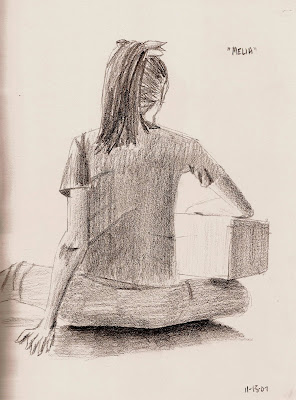
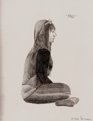
The next model was Molly. I am a lot happier with the way this one turned out. It actually looks a little like her, which is a big accomplishment on my part. I think I did better on the shading than Melia's. Its amazes me at how the slightest difference in pressure you put on the pencil changes the demension of what you're drawing.
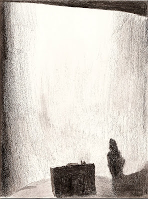
 I thought this one was going to be easy....2 pencils and a half an eraser later, I realized different. This really made me separate myself from what I saw and what I knew to be there. I knew the wall was white in the picture. But when looking at it and all of the shadow on it, only a small portion of it was actually white. It was hard to gradate towards that, while still keeping the wall looking smooth and wall-like. I still think I could have done a better job...but who doesn't think that?

The next model was Molly. I am a lot happier with the way this one turned out. It actually looks a little like her, which is a big accomplishment on my part. I think I did better on the shading than Melia's. Its amazes me at how the slightest difference in pressure you put on the pencil changes the demension of what you're drawing.
 I thought this one was going to be easy....2 pencils and a half an eraser later, I realized different. This really made me separate myself from what I saw and what I knew to be there. I knew the wall was white in the picture. But when looking at it and all of the shadow on it, only a small portion of it was actually white. It was hard to gradate towards that, while still keeping the wall looking smooth and wall-like. I still think I could have done a better job...but who doesn't think that?
Tuesday, November 13, 2007


Tuesday, November 6, 2007
Fun with Shading!!
Have I mentioned that I love shading?? Because...I love shading..
I spent about ten minutes trying to put together complicated still-lifes in order to draw them....finally I got frustrated and settled for one of my metal push-pins. I am satisfied with the outcome. I like how the bottom pin turned out.
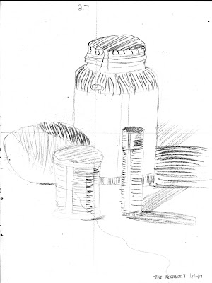 With this exercise, we were to to use only two values to differentiate between the shaded areas on our still-lifes.
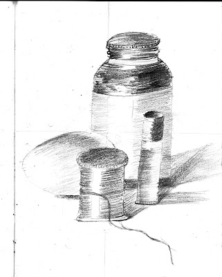
Th second part of the exercise allowed us to use more than only two values in order to develop a more complete composition.
I actually like the background a lot better than the foreground. I forgot to put more detail in the closer bench. Note to self: The closer things are, the more details they have.
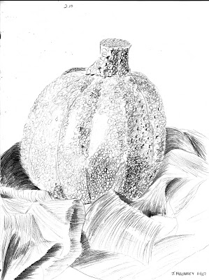
These two objects (the pumpkin lamp and fabric) have two very different textures: bumpy and smooth. I tried, as best as I could, to show these different textures.
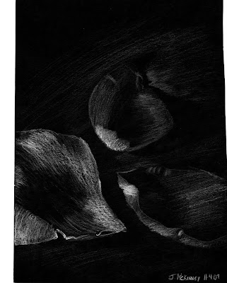 This is my favorite picture. I really like doing the white-on-black shading. It really makes the drawer pay attention to where the light is hitting on the object being drawn (in this case, rose petals.)

I spent about ten minutes trying to put together complicated still-lifes in order to draw them....finally I got frustrated and settled for one of my metal push-pins. I am satisfied with the outcome. I like how the bottom pin turned out.
 With this exercise, we were to to use only two values to differentiate between the shaded areas on our still-lifes.
Th second part of the exercise allowed us to use more than only two values in order to develop a more complete composition.

I actually like the background a lot better than the foreground. I forgot to put more detail in the closer bench. Note to self: The closer things are, the more details they have.

These two objects (the pumpkin lamp and fabric) have two very different textures: bumpy and smooth. I tried, as best as I could, to show these different textures.
 This is my favorite picture. I really like doing the white-on-black shading. It really makes the drawer pay attention to where the light is hitting on the object being drawn (in this case, rose petals.)
Friday, November 2, 2007
i LOVE shading
I think that this is something that I am fairly comfortable with. I know that I can improve a lot, but I already like the outcome of everything that I try to draw with value. I love that we are learning about different shading techniques. In the bottom three pictures, I experimented with hatching , cross-hatching, stipling, and diagonal lines.


Subscribe to:
Posts (Atom)
